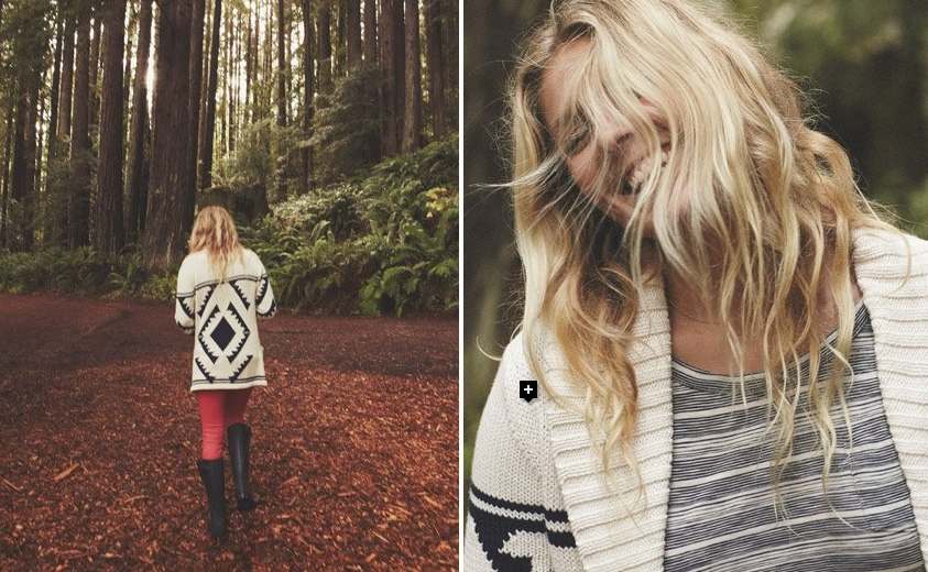
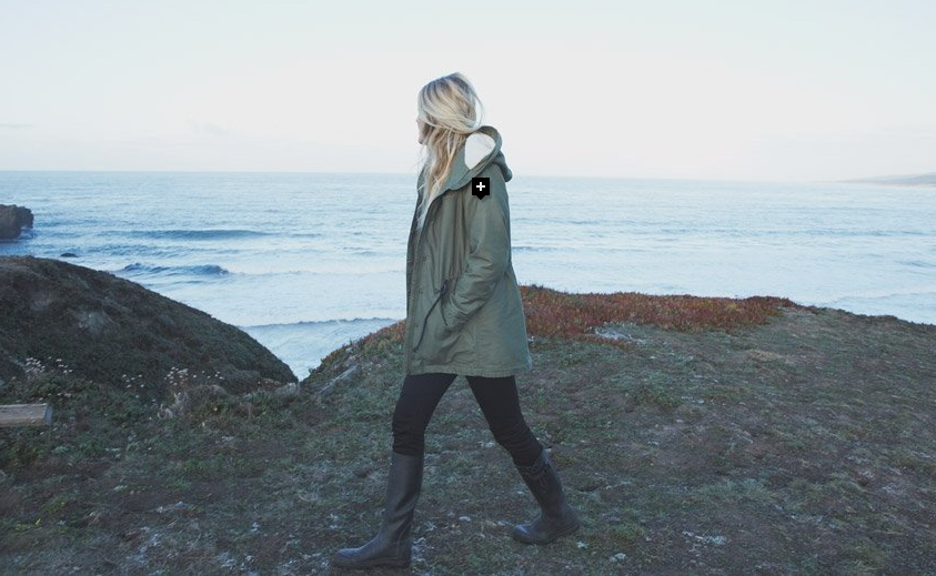
I really love the Quiksilver fall/winter 2013 lookbook. This really emulates nature, comfort and all things cozy and warm.
We are analyzing ads in fashion class and it is very interesting to see what goes into an advertisement and why. I love how Quiksilver uses the natural atmosphere to really draw their target market into buying their clothes.
So natural and down to earth, I love it.
I love the above ensemble, so comfortable and chic at the same time.
I love the green jacket and am on the hunt for one!
Ps. Don’t forget to enter in my giveaway, ends soon! 🙂
Photos c/o Quiksilver


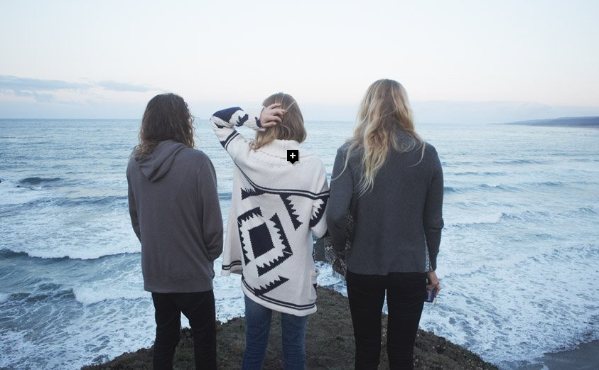
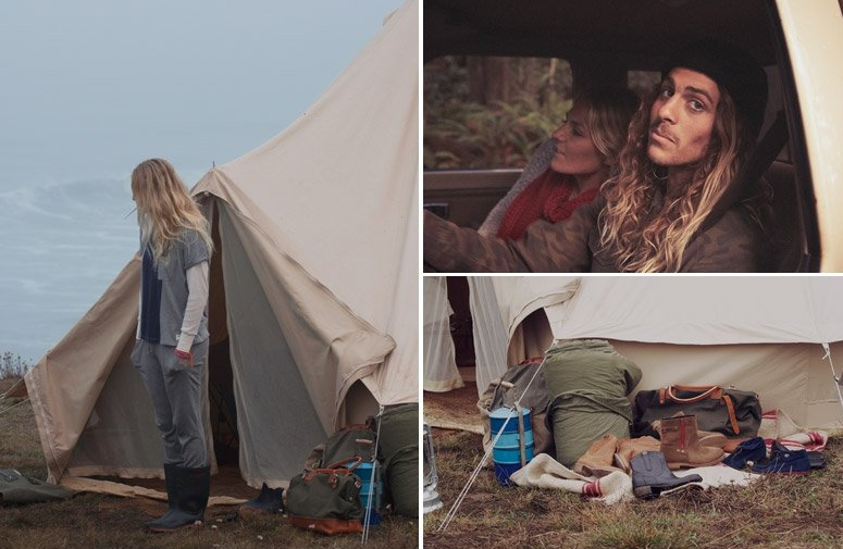

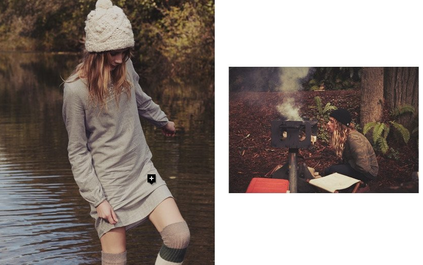

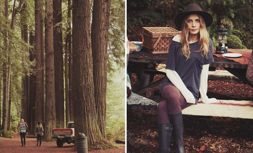

super loving the concept of this shoot! using natural beauty and comfy concept <333
Love,
Pudding Monster
Krystin: What a wonderful analysis of the Quiksilver marketing ad. I can completely understand their customer demographic based on the ad. Thanks for sharing the ads. The photos are gorgeous. I would live to stay in the loop with your posts. If you are interested in following each other on Google Plus let me know. I am a fashion blogger and writer.
Sharon
http://www.afashioncrowd.blogspot.com
I love the collection! Really like the aztecish prints!
I've always liked Quicksilver and this shows again what a lovely brand they are 🙂 Nice photos indeed!
Lu
Bloggers World Calendar 2014
http://www.balgarka.co.uk